Design Principles for Reducing Cognitive Load
A look at both the causes and ways to reduce extraneous mental processing for the user.
This article was originally published on A List Apart.
As humans, we have an underlying “blueprint” for how we perceive and process the world around us, and the study of psychology helps us define this blueprint. As designers, we can leverage psychology to build more intuitive, human-centered products and experiences. Instead of forcing users to conform to the design of a product or experience, we can use some key principles from psychology as a guide for designing how people actually are.
But knowing where to start can be a challenge. Which principles from psychology are useful? What are some examples of these principles at work? In this article, I’ll cover the basics, and discuss the ethical implications of using psychology in design.
The intersection of psychology and design is extensive. There’s an endless list of principles that occupy this space, but there are a few that I’ve found more ubiquitous than others. Let’s take a look at what these are and where they are effectively leveraged by products and experiences we interact with everyday.
One of the primary functions we have as designers is to synthesize information and present it in a way that it doesn’t overwhelm users—after all, good communication strives for clarity. This directly relates to our first key principle: Hick’s Law. Hick’s Law predicts that the time it takes to make a decision increases with the number and complexity of choices available. It was formulated by psychologists William Edmund Hick and Ray Hyman in 1952 after examining the relationship between the number of stimuli present and an individual’s reaction time to any given stimulus.
It turns out there is an actual formula to represent this relationship: RT = a + b log2 (n). Fortunately, we don’t need to understand the math behind this formula to grasp what it means. The concept is quite simple: the time it takes for users to respond directly correlates to the number and complexity of options available. It implies that complex interfaces result in longer processing time for users, which is important because it’s related to a fundamental theory in psychology known as cognitive load.
Cognitive load refers to the mental processing power being used by our working memory. Our brains are similar to computer processors in that we have limited processing power: when the amount of information coming in exceeds the space available, cognitive load is incurred. Our performance suffers and tasks become more difficult, which results in missed details and even frustration.
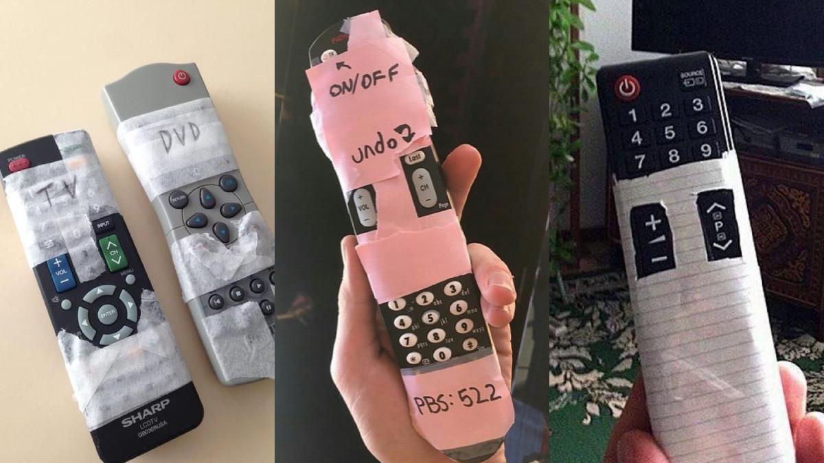
There are examples of Hick’s Law in action everywhere, but we’ll start with a common one: remote controls. As features available in TVs increased over the decades, so did the options available on their corresponding remotes. Eventually we ended up with remotes so complex that using them required either muscle memory from repeated use or a significant amount of mental processing. This led to the phenomenon known as “grandparent-friendly remote.” By taping off everything except for the essential buttons, grandkids were able to improve the usability of remotes for their loved ones, and they also did us all the favor of sharing them online.

In contrast, we have smart TV remotes: the streamlined cousin of the previous example, simplifying the controls to only those absolutely necessary. The result is a remote that doesn’t require a substantial amount of working memory and therefore incurs much less cognitive load. By transferring complexity to the TV interface itself, information can be effectively organized and progressively disclosed within menus.
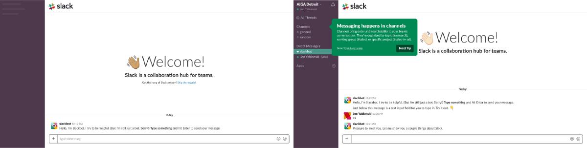
Let’s take a look at another example of Hick’s Law. Onboarding is a crucial but risky process for new users, and few nail it as well as Slack. Instead of dropping users into a fully featured app after enduring a few onboarding slides, they use a bot (Slackbot) to engage users and prompt them to learn the messaging feature consequence-free. To prevent new users from feeling overwhelmed, Slack hides all features except for the messaging input. Once users have learned how to message via Slackbot, they are progressively introduced to additional features.
This is a more effective way to onboard users because it mimics the way we actually learn: we build upon each subsequent step, and add to what we already know. By revealing features at just the right time, we enable our users to adapt to complex workflows and feature sets without feeling overwhelmed.
Another key principle is Miller’s Law, which predicts that the average person can only keep 7 (± 2) items in their working memory. It originates from a paper published in 1956 by cognitive psychologist George Miller, who discussed the limits of short-term memory and memory span. Unfortunately there has been a lot of misinterpretation regarding this heuristic over the years, and it’s led to the “magical number seven” being used to justify unnecessary limitations (for example, limiting interface menus to no more than seven items).
Miller’s fascination with short-term memory and memory span centered not on the number seven, but on the concept of “chunking” and our ability to memorize information accordingly. When applied to design, chunking can be an incredibly valuable tool. Chunking describes the act of visually grouping related information into small, distinct units of information. When we chunk content in design, we are effectively making it easier to process and understand. Users can scan the content and quickly identify what they are interested in, which is aligned with how we tend to consume digital content.

The simplest example of chunking can be found with how we format phone numbers. Without chunking, a phone number would be a long string of digits, which increases the difficulty to process and remember it. Alternatively, a phone number that has been formatted (chunked) becomes much easier to interpret and memorize. This is similar to how we perceive a “wall of text” in comparison to well-formatted content with appropriate headline treatments, line-length, and content length.
Another example of chunking being used effectively in design is with layout. We can use this technique to help users understand underlying relationships and hierarchy by grouping content into distinctive modules. Especially in information-dense experiences, chunking can be leveraged to provide structure to the content. Not only is the result more visually pleasing, but it’s more scannable.
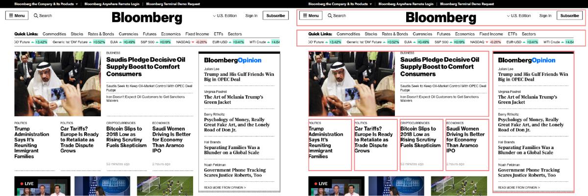
The last principle we’ll look at is Jakob’s Law (short for Jakob’s Law of Internet User Experience), which states that users spend most of their time on other sites, and they prefer your site to work the same way as all the other sites they already know. In 2000, it was put forth by usability expert Jakob Nielsen, who described the tendency for users to develop an expectation of design patterns based on their cumulative experience from other websites. This principle encourages designers to follow common design patterns in order to avoid confusing users, which can result in higher cognitive load.
I know what you’re thinking: if all websites followed the same design patterns, that would make for quite the boring web. The answer is yes, that is probably true. But there is something incredibly valuable to be found in familiarity for users, which leads us to another fundamental concept in psychology that is valuable for designers: mental models.
A mental model is what we think we know about a system, especially about how it works. Whether it’s a website or a car, we form models of how a system works, and then we apply that model to new situations where the system is similar. In other words, we use knowledge we already have from past experiences when interacting with something new.
Mental models are valuable for designers, because we can match our user’s mental model to improve their experience. Consequently, users can easily transfer their knowledge from one product or experience to another without taking time to understand how the new system works. Good user experiences are made possible when the designer’s mental model is aligned with the user’s mental model. The task of shrinking the gap between our mental models and those of our users is one of our biggest challenges, and to achieve this we use a variety of methods: user interviews, personas, journey maps, empathy maps, and more. The point of all this is to gain a deeper insight into not only the goals and objectives of our users but also their pre-existing mental models, and how that applies to the product or experience we are designing.
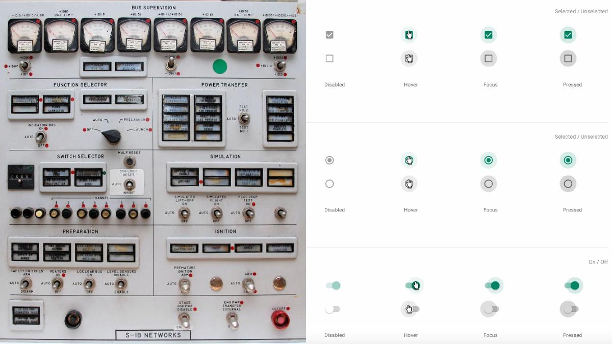
Have you ever wondered why form controls look the way they do? It’s because the humans designing them had a mental model for what these elements should look like, which they based on control panels they were already familiar with in the physical world. Things like form toggles, radio inputs, and even buttons originated from the design of their tactile counterparts.
As designers, we must close the gap that exists between our mental models and that of our users. It’s important we do this because there will be problems when they aren’t aligned, which can affect how users perceive the products and experiences we’ve helped build. This misalignment is called mental model discordance, and it occurs when a familiar product is suddenly changed.
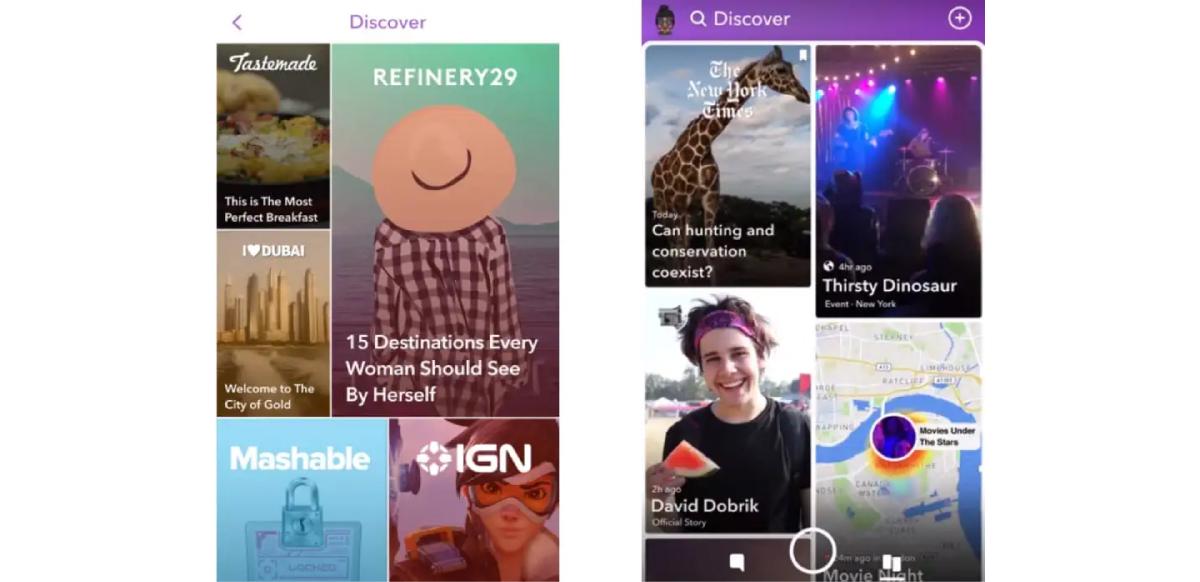
Take for example Snapchat, which rolled out a major redesign in early 2018. They launched a reformatted layout, which in turn confused users by making it difficult to access features they used on a daily basis. These unhappy users immediately took to Twitter and expressed their disapproval en masse. Even worse was the subsequent migration of users to Snapchat’s competitor, Instagram. Snapchat had failed to ensure the mental model of their users would be aligned with the redesigned version of their app, and the resulting discordance caused major backlash.
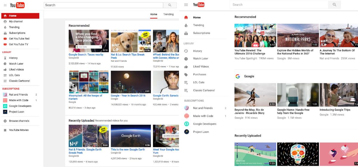
But major redesigns don’t always have to result in backlash—just ask Google. Google has a history of allowing users to opt in to redesigned versions of their products like Google Calendar, YouTube, and Gmail. When they launched the new version of YouTube in 2017 after years of essentially the same design, they allowed desktop users to ease into the new Material Design UI without having to commit. Users could preview the new design, gain some familiarity, submit feedback, and even revert to the old version if they preferred it. As a result, the inevitable mental model discordance was avoided by simply empowering users to switch when they were ready.
You might be thinking, “These principles are great, but how do I use them in my projects?” While nothing will replace actual user research and data specific to our projects, we can use these psychological principles to serve as a guide for designing more intuitive, human-centered products and experiences. Being mindful of these principles helps us create designs that consider how people actually are, as opposed to forcing them to conform to the technology. To quickly recap:
We’ve covered some key principles that are useful for building more intuitive, human-centered products and experiences. Now let’s touch on their ethical implications and how easy it can be to fall into the trap of exploiting users with psychology.
On the one hand, designers can use psychology to create more intuitive products and experiences; on the other, they can use it to exploit how our minds work, for the sake of creating more addictive apps and websites. Let’s first take a look at why this is a problem, and then consider some potential solutions.
One doesn’t have to go far to see why the well-being of users being deprioritized in favor of profit is a problem. When was the last time you were on a subway, on a sidewalk, or in a car and didn’t see someone glued to their smartphone? There are some that would argue we’re in the middle of an epidemic, and that our attention is being held captive by the mini-computers that we carry with us everywhere.
It wouldn’t be an exaggeration to say that the mobile platforms and social networks that connect us also put a lot of effort into how they can keep us glued, and they’re getting better at it every day. The effects of this addiction are beginning to become well-known: from sleep reduction and anxiety to deterioration of social relationships, it’s becoming apparent that the race for our attention has some unintended consequences. These effects become problematic when they start to change how we form relationships and how we view ourselves.
As designers, our responsibility is to create products and experiences that support and align with the goals and well-being of users. In other words, we should build technology for augmenting the human experience, not replacing it with virtual interaction and rewards. The first step in making ethical design decisions is to acknowledge how the human mind can be exploited.
We must also question what we should and shouldn’t build. We can find ourselves on quite capable teams that have the ability to build almost anything you can imagine, but that doesn’t always mean we should—especially if the goals of what we are building don’t align with the goals of our users.
Lastly, we must consider metrics beyond usage data. Data tells us lots of things, but what it doesn’t tell us is why users are behaving a certain way or how the product is impacting their lives. To gain insight into why, we must both listen and be receptive to our users. This means getting out from behind a screen, talking with them, and then using this qualitative research to inform how we evolve the design.
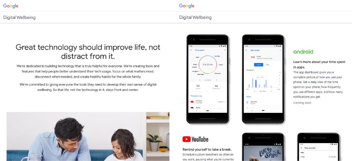
It’s been great to see companies taking the right steps when it comes to considering the digital well-being of users. Take for example Google, which just announced tools and features at their latest I/O event that focus on helping people better understand their tech usage, focus on what matters most, disconnect when needed, and create healthy digital habits. Features like an app dashboard that provides a usage overview, additional control over alerts and notifications, and Family Link for setting digital ground rules for the little ones all are geared towards protecting users.
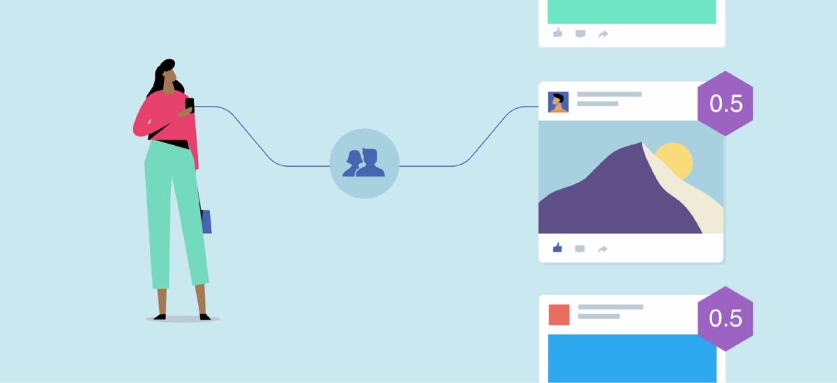
Some companies are even redefining their success metrics. Instead of time on site, companies like Facebook are defining success through meaningful interactions. This required them to restructure their news feed algorithm to prioritize the content that people actually find valuable over the stuff we mindlessly consume. Content from friends and family now takes precedence, even if the result means users spend a little less time in their app.
These examples are just a glimpse into the steps that many companies are taking, and I hope to see many more in the coming years. The technology we play a part in building can significantly impact people’s lives, and it’s crucial that we ensure that impact is positive. It’s our responsibility to create products and experiences that support and align with the goals and well-being of users. We can make ethical design decisions by acknowledging how the human mind can be exploited, consider what we should and shouldn’t build, and talk with users to gain qualitative feedback on how the products and experiences we build affect their lives.
There are tons of great resources we can reference for making our designs more intuitive for users. Here are a few I have referenced quite frequently:
A look at both the causes and ways to reduce extraneous mental processing for the user.
How a classic problem-solving principle can help improve our designs.