Peak-End Rule
Why designers should pay close attention to the key peak moments during an experience.
This article was originally published the blog of Jon Yablonski.
In this series, we’ll take a look at various digital experiences and examine each by dissecting it step by step to identify relevant heuristics and concepts rooted in psychology. Kicking the series off will be Google Search — the ubiquitous utility that helps countless people find information in the vast expanse of the Internet every day. We’ll begin with the landing page and the process of searching before moving on to search results. Let’s begin!
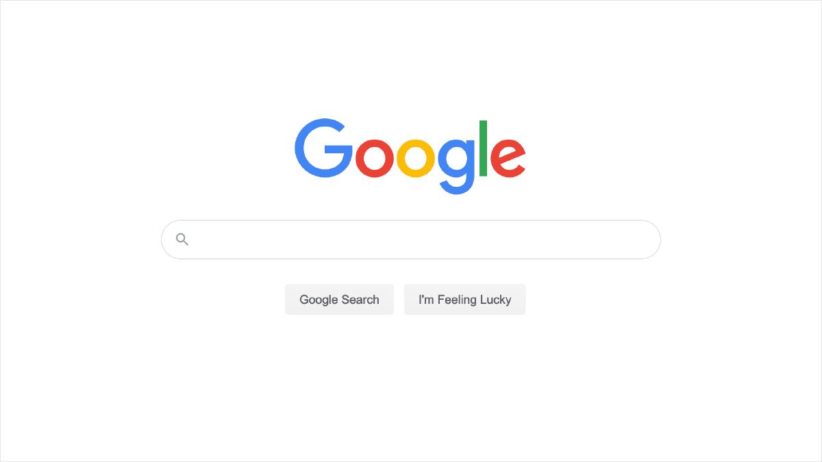
Google’s landing page has only slightly changed in the 21+ years of its existence. The purpose of this page has remained singularly focused: provide a quick and easy way for people to search the Web. In fact, it’s done this so efficiently that the act of searching the web has become synonymous with the company name. A major contributor to the success of Google Search is its simplicity. The page consist primarily of a search input that’s positioned in the approximate center and is focused by default — ready to receive a search keyword. Once you begin typing, a list of predicted keywords based on what you’ve typed thus far appear below in input. This list of predicted keywords continues to update as you type and is designed to surface the keyword you’re likely to type before you’ve finished, therefore saving you keystrokes (and mental energy).
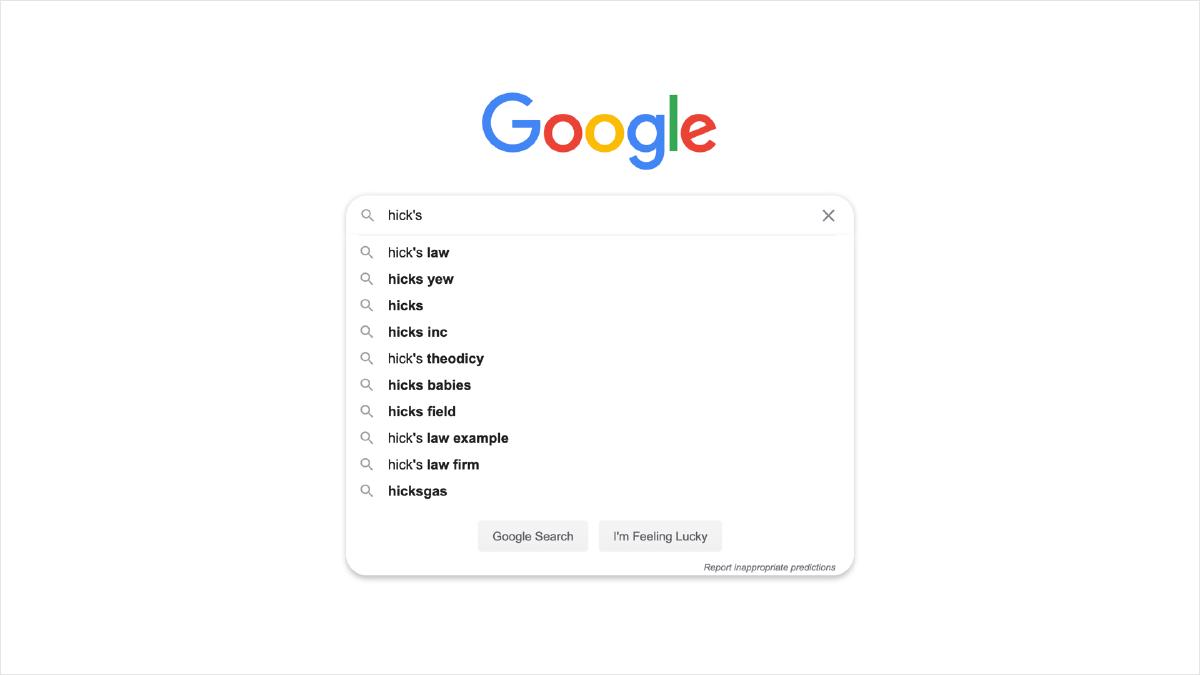
A key psychology heuristic in play on the landing page of Google Search is Hick’s Law, which states that the time it takes to make a decision increases with the number and complexity of choices. Google keeps the decisions required to enter a keyword to a minimum by eliminating any additional content that could distract from the act of typing a keyword or require additional decision-making. The design reinforces this single goal of keeping the page focused on the act of searching by prominently placing the search input, auto-focusing the search input by default and stripping away additional search options. Hick’s Law is once again demonstrated as you begin typing and predicted keywords appear, eliminating the need to spell out the entire word (assuming a match is found). Google’s goal is to initiate search based on a search query as quickly as possible and it supports this goal by removing any friction that could lead to additional decision-making.
The next step in Google Search is the search results page, which displays results it found based on your search query. The original search keyword is displayed prominently at the top of the page, along with additional options for filtering the results. Results are presented in a list and each one is visualized as discernible chunks of content that’s separated by ample spacing, so it’s easy to differentiate one result from the next. When appropriate, this page will also show a definition for the search term at the top of results as well as a sidebar card that links to more information regarding the term (typically on Wikipedia).
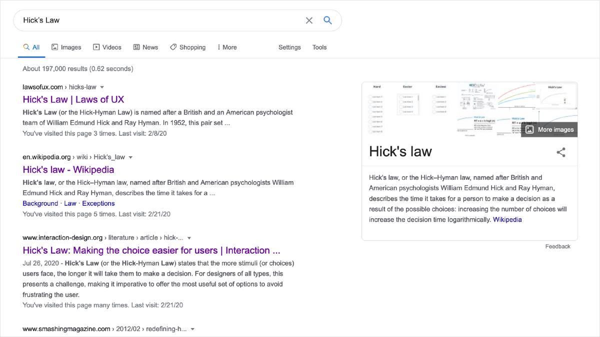
Hick’s Law is also carried into the search results page from the previous page. This is where you’ll find additional options for modifying your search, not on landing page where the goal is to remove as much friction as possible. It’s only once you’ve entered a search query that the additional options to filter the results and therefore additional decisions are made available.
Another important design feature to point out on the search results page is that the original search query is still being shown, which is helpful due to the way our minds store information in memory. Working memory is the cognitive system that holds information temporarily and is important for reasoning and the guidance of decision-making and behavior. It’s limited in capacity, so the more decisions being made means the less likely we are to quickly remember items that previously set in working memory. You can think of each item on the page as being a potential decision point: people scan the page in search of information that relates to what they’re looking for, and mentally evaluates if the content resembles something that could help them achieve their goal. Regarding Google Search, it’s helpful to see the original search term in the case that they forget what was originally being searched.
The next important key detail of Google Search is performance. Google Search is known for its speed in delivering results based on a query — it even displays the time in which it took to fetch those results at the top of the page. This directly relates to the Doherty Threshold, which states that productivity soars when a computer and its users interact at a pace (<400ms) that ensures that neither has to wait on the other. If the search results took a long time to return, it’s possible you could begin to think of something else. Instead, Google priortizes performance and returns the results as rapidly as possible. As a result, it ensures we are remaining focused on the task at hand and we have the results we need to learn more. Performance is a critical part of the overall user experience and Google understands this.
Now let’s move on to the visual aspects of the search results page, which is optimized for scannability. As was already mentioned, each result is presented in a list and each one is visualized as a discernible chunk of content with ample spacing between other results. This not only makes it easier to differentiate one result from the next, but it also helps people quickly scan the results and identify which result is most likely to contain the information they’re looking for. The hierarchy of information in each result is clear, consistent and also lends itself to being easily scannable. This is closely related to the psychological concept of chunking, a process by which individual pieces of an information set are broken down and then grouped together in a meaningful whole. When applied to UX design, chunking helps to guide how we group and organize content. When we chunk content in design, we are effectively making it easier to comprehend. People can then scan the content, identify the information that aligns with their goals, and consume that information in an effort to achieve their goal.
By structuring content into visually distinct groups with a clear hierarchy, we can align the information we present with how people evaluate and process digital content.
Lastly, it’s impossible to dissect visual information without recalling Gestalt psychology and Google Search results demonstrates quite a few. One very noticeable Gestalt law in effect is the Law of Proximity, which states that objects that are near, or proximate to each other, tend to be grouped together. The spacing between each result contributes to the overall scannability of the page but also helps to effectively group each result as a related cluster of information. Additionally, the Law of Uniform Connectedness can also be seen with the border that surrounds specific items such as videos and ‘featured snippets’. This border helps to visually connect the content and also separate it from other results by giving it a bit more priority. It’s an additional layer of hierarchy on the page that helps once again with scannability.
Google Search has been incrementally refined over it’s 21+ years of its existence in order to optimize people’s ability to quickly get information based on a search keyword. It has achieved this by eliminating friction, prioritizing performance and ensuring results are easily scannable. They’ve refined this experience to a science and as a result have made Google Search the ubiquitous utility that helps countless people find information in the vast expanse of the Internet every day.
Why designers should pay close attention to the key peak moments during an experience.
A look at how designers can leverage psychology to build more intuitive, human-centered products and experiences.
A look at both the causes and ways to reduce extraneous mental processing for the user.