Tesler’s Law
For any system there is a certain amount of complexity that cannot be reduced.
The Paradox of the Active User is the tendency for users to never read manuals but start using the software immediately. This observation was first defined by Mary Beth Rosson and John Carroll in 1987 as part of their larger work on interaction design, Interfacing Thought: Cognitive Aspects of Human-Computer Interaction.1 Rosson and Carroll found that new users were not reading the manuals supplied with their computers and instead would just get started using them, even if it meant getting into errors and running into roadblocks.
Fast forward to today and the need for instructional manuals to operate computers is increasingly rare. Operating an internet-connected device has become second nature to many. However, this paradox can still be observed when people encounter a new product or service, and nowhere is this more apparent than during the onboarding process. Traditional product tours can be a hindrance to active users. Instead, onboarding should be designed with active users in mind, making guidance accessible throughout the product experience.
Have you experienced an onboarding process that requires clicking through a series of information before you can ever start using the product or service? Odds are that you have and that you read very little or any of that information. Turns out, this is an incredibly common pattern known as a product tour. It’s an onboarding method that makes use of sequential overlays to highlight important elements and demonstrate how they work.

If you think about onboarding from the perspective of active users, not only are product tours a pain but they are preventing users from immediately interacting with your product or service. Users are often motivated to complete their immediate tasks which means they don’t want to spend time upfront reading about how your product or service works or learning about its key features before being able to use it. It’s an example of how technology can force users to conform rather than work with the grain of human behavior.
How might we enable active users to immediately start using products and services without having to undergo a lengthy onboarding process while still providing guidance when it’s valuable? To adapt, designers can make guidance accessible throughout the product experience and design it to fit within the context of use. This approach will help active new users no matter what path they choose to take.
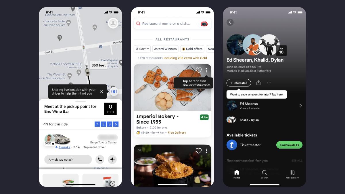
One tool we can leverage that makes guidance accessible throughout the product experience is via in-product elements like tooltips. Tooltips provide helpful information to users so they can learn through a process of discovery in a contextually relevant way. They are a lightweight, low-friction, and contextually relevant way to provide helpful information at just the right time and aid in the discoverability of new features or functionality.

An alternative strategy to seamlessly integrate new users into the system is what’s commonly referred to as progressive onboarding. This method is designed to gradually build the user’s familiarity with the platform, instilling confidence as they navigate through its features. Instead of overwhelming users with information all at once, this approach allows them to explore and learn about the system’s features at a comfortable speed. Users are given the liberty to discover and master additional functionalities as they progress, promoting a user-friendly experience that encourages exploration and learning.

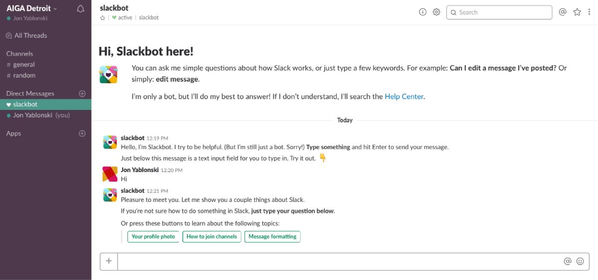
A classic example of progressive onboarding was demonstrated by Slack. Instead of dropping users into a fully featured app after subjecting them to a few onboarding slides, Slack used a bot (Slackbot) to engage users and prompt them to learn about the messaging features in a risk-free way. To prevent new users from feeling overwhelmed, Slack hid all features except for the messaging input. Once users have learned how to message with Slackbot, they are progressively introduced to additional features. This is an effective way to onboard users because it mimics the way we learn: we build upon each previous step and add to what we already know. By revealing features at just the right time, we can enable our users to adapt to complex workflows and feature sets without feeling overwhelmed.
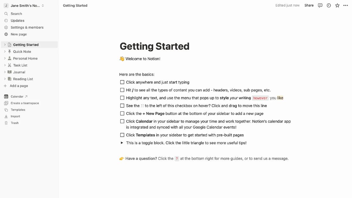
Another interesting approach to onboarding that aligns with how active users behave is a dedicated ‘get started’ template. This approach guides users to learn the core features of Notion while still allowing them to explore at their own pace.

Notion helps beginners learn the basics of their product by providing an easy-to-follow checklist to follow. This is an effective way to onboard users because it guides them in a risk-free environment that enables them to actively learn the features and functionalities of the app by using it. Additionally, a getting started template safeguards users from feeling overwhelmed with an endless amount possibilities. It’s an unobtrusive form of guidance that aligns with the behavior of active users which they can continue to revisit whenever they need.
The Paradox of the Active User describes the tendency for users to dive into software use without reading manuals. While we no longer have to worry about whether or not users are reading manuals to operate their computers, this tendency still exists in the form of onboarding. Traditional product tours can be a hindrance to active users. Instead, onboarding should be designed with active users in mind, making guidance accessible throughout the product experience.
We must remember to not build products and services for an idealized, rational user because people don’t always behave rationally in real life. Instead, we can account for this paradox by making guidance accessible throughout the product experience. We can design it to fit within the context of use so that it can help these active new users, no matter what path they choose to take.
Carroll, J.M. and Rosson, M.B. (1987). The paradox of the active user. In J.M. Carroll (Ed.), Interfacing Thought: Cognitive Aspects of Human-Computer Interaction (Cambridge, MA: MIT Press). ↩︎